Achievemint Android App
During my time working on Achievemint, an Android app was one of the most requested features by members. I worked to design the complete Achievemint experience for Android.
Considerations
When first starting the design, I wanted to make sure that it fit visually and worked well on Android. I am not an Android user, so I leveraged the Google Material Design guidelines while designing the app. An example of designing with Material Design patterns in a series of settings screens.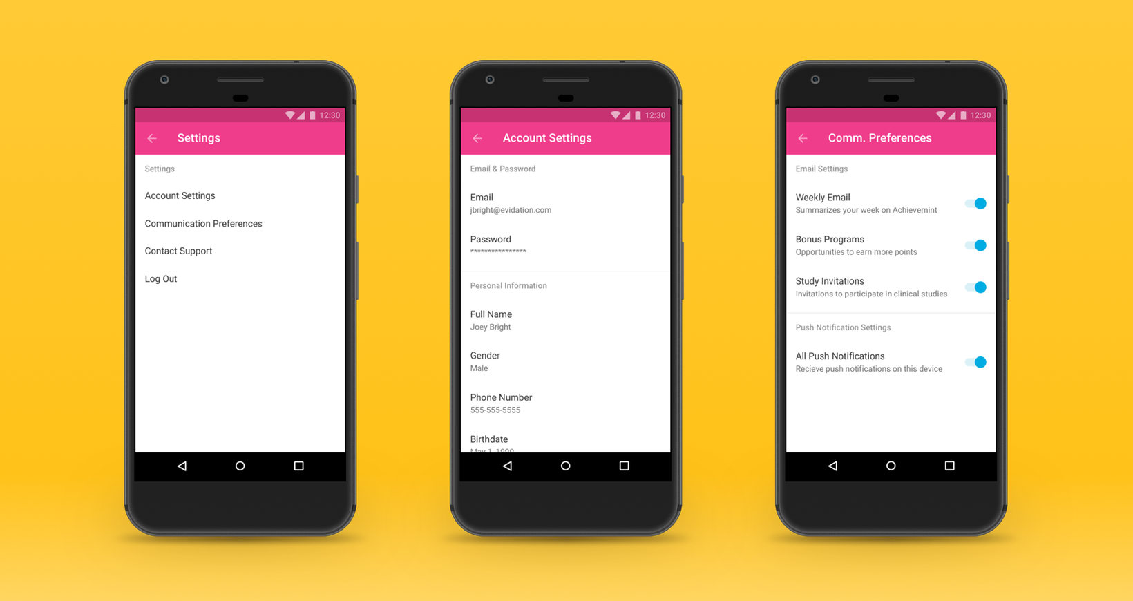
Choosing Global Navigation
Global navigation was a challenge while designing the app. There were only two main navigation items, Activity and Profile. The Material Design guidelines suggestion was to utilize the tab bar to display these navigation items.
I chose a bottom bar navigation system even though it was not recommended. I felt this was the best solution. The bottom bar navigation would allow the app to scale to accommodate new features in the pipeline without completely changing the navigation paradigm. The chosen direction for global navigation against an early wireframe showing a tab-based approach.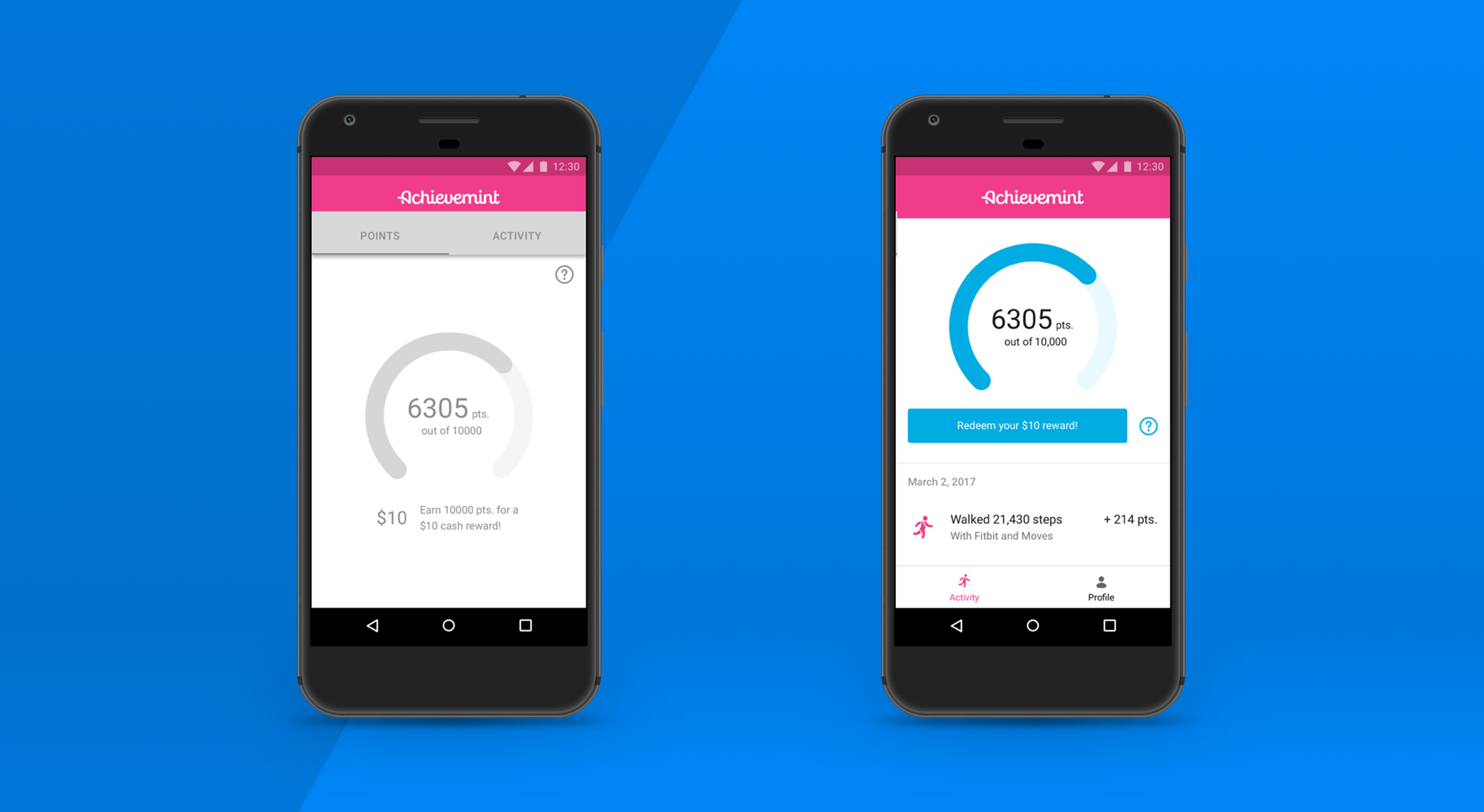
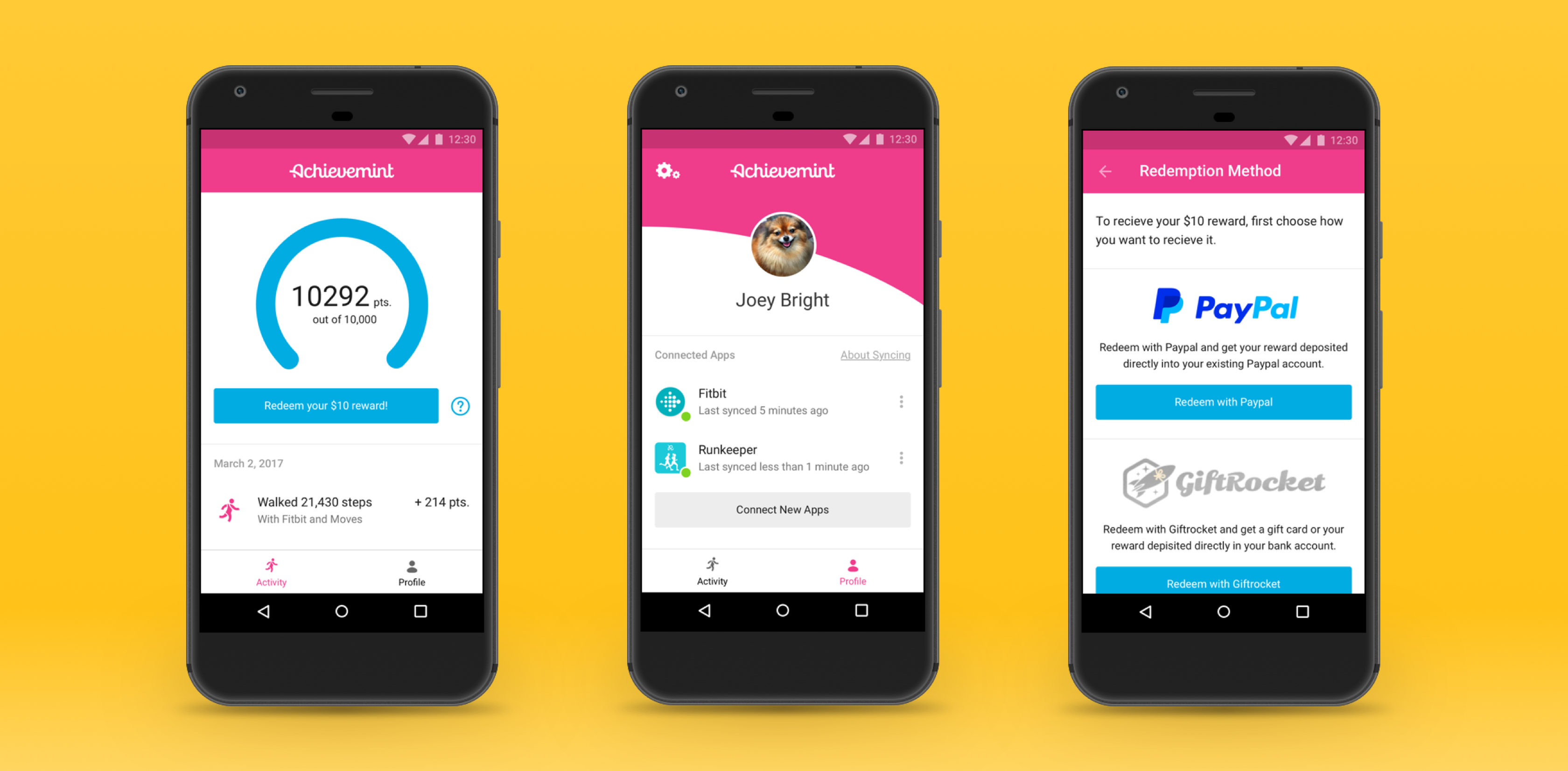
Connecting An App
A key feature of Achievemint is connecting an application. by connection apps such as Fitbit, members earn point that they can after reaching a threshold, trade for a cash reward.
Given at the time, earning points could only be done by connecting an app, this flow was an important part of the app. Showing the flow for connecting an app to Achievemint.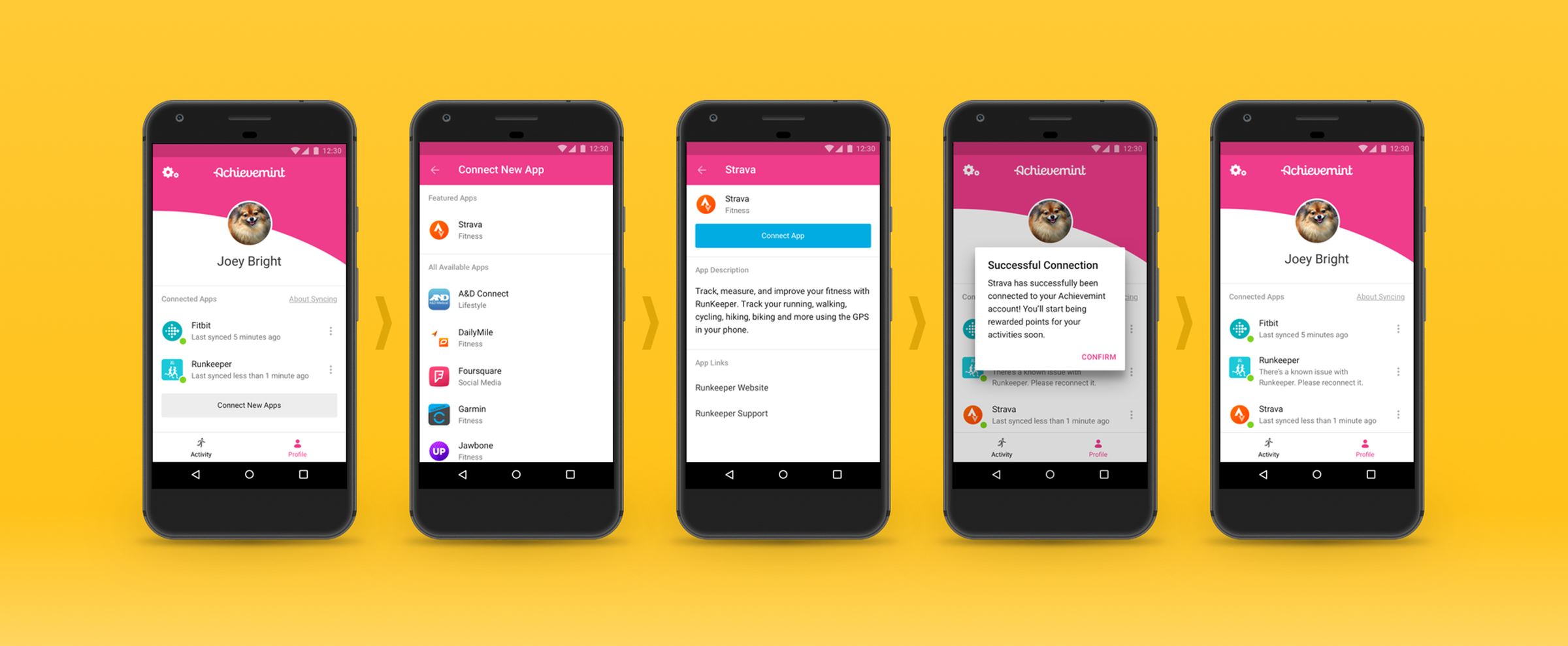
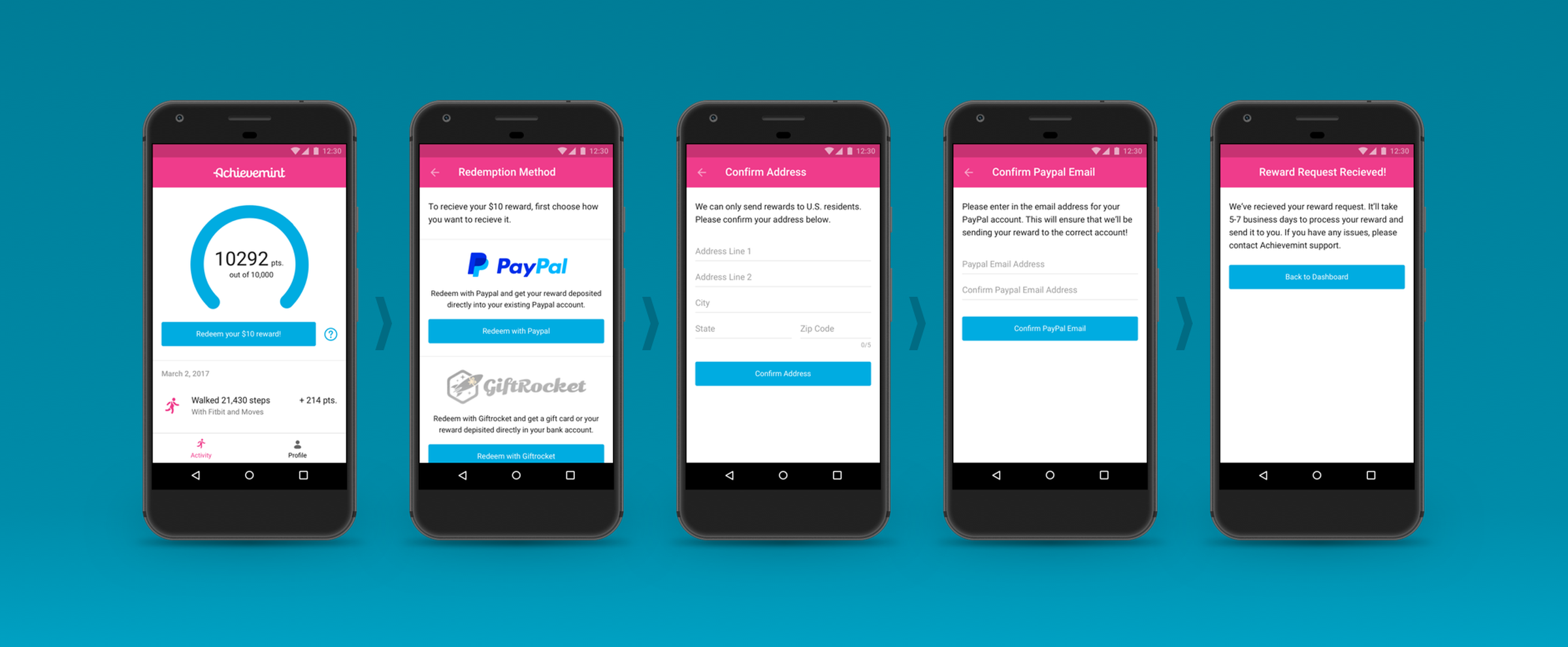
Rewards
An important part of Achievemint for members is rewards. When they’ve earned enough points to redeem a reward, it’s important that their experience in getting their reward is quick and simple, as to not distract them away from their feeling of accomplishment.
Design choices such as a breaking up required information into discrete screens, consistent and clear calls to action, and forms with clear intent and as few fields as possible made the flow simple. Showing reward redemption when a member earned 10,000 points.