Mighty Networks Global Navigation Redesign
I worked with the Mighty Networks design team to complete a large-scale redesign of the global navigation on iOS, Web, and Android platforms.
Problem
Through user feedback and research, we discovered that both administrators and members of a Mighty Network had difficulty navigating the app, both on web and mobile platforms.
When prompt to do simple tasks such as find certain features or change their personal settings, most people failed. They would even get lost in the app after diving deeper into a Network, which made it difficult to get anything done. Most of the navigation for a Mighty Network was previously hidden behind the 9-dot icon shown in the image above.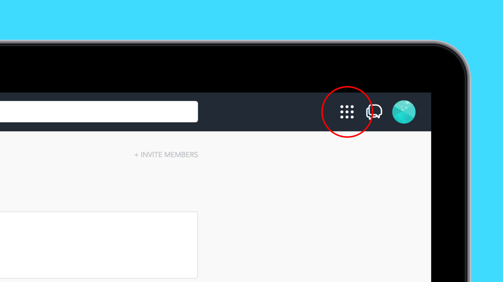
To ensure that the app could grow to accomidate new features and that our customers had a better experience, the problem needed to be fixed as soon as possible.
Challenge
The largest challenge of this project was that it touched the entire interface on all platforms (Web, iOS, Android, and mobile web). Large-scale changes such as redesigning global navigation can have negative unintended consiquences on customers. Being thorough about designing the new navigation to work across all areas of the app and heaviliy user testing the designs was key to making these changes positive for our members.
Revisiting the Existing Navigation
The existing navigation for the app had been built up over years as the product was changing and growing. Through all that time, features were added, removed, and changed multiple times. The existing navigation wasn't built for this evolution of the product.
In addition, through testing, we found that because the navigation was almost invisible to members. Most tried to guess where the navigation was and (sometimes) guessed that it was behind the correct menu. Further, because there was no anchor, or breadcrumbs, people got lost in the app and were constantly unsure of where they were or where they came from.
Because of this, we had a few key goals for this new navigation:
- Make sure that the new navigation accomidated all features and could adapt as the product changed over time.
- Ensure the location and behavior of the navigation was as clear as possible.
- Introduce new elements that helped anchor members within the app, allowing them to navigate deeply into a Network without getting lost.
The first step in the process to achieve these goals was to explore different solutions through sketching and wireframing.
Sketching & Wireframing
The design team and I began by independently sketching concepts in order to generate as many ideas as possible. At this time, nothing was off the table. Anything about the produdct could be changed, edited, or removed. A handful of my sketches.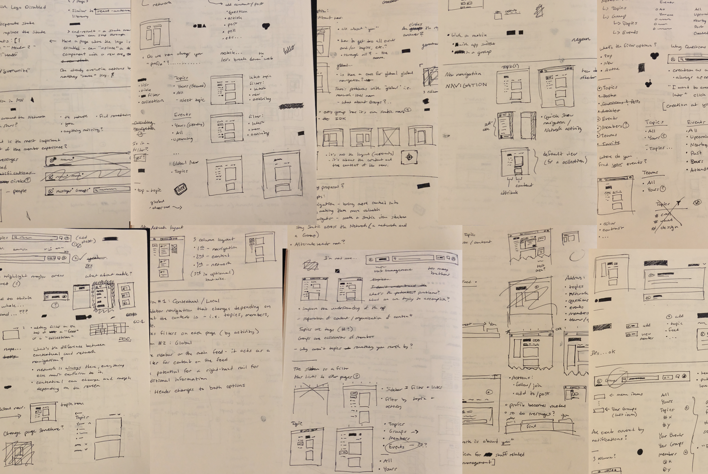
After coming together and comparing our work, I was asked to further develop a few of the ideas I came up with, along with integrating some of the ideas that other members of the team developed. I chose to do quick low-fidelity wireframes of my work so I could continue to explore quickly but in a format that was easier to share. My first round of wireframes - super rough with the intention of putting together workable prototypes for the team to go through.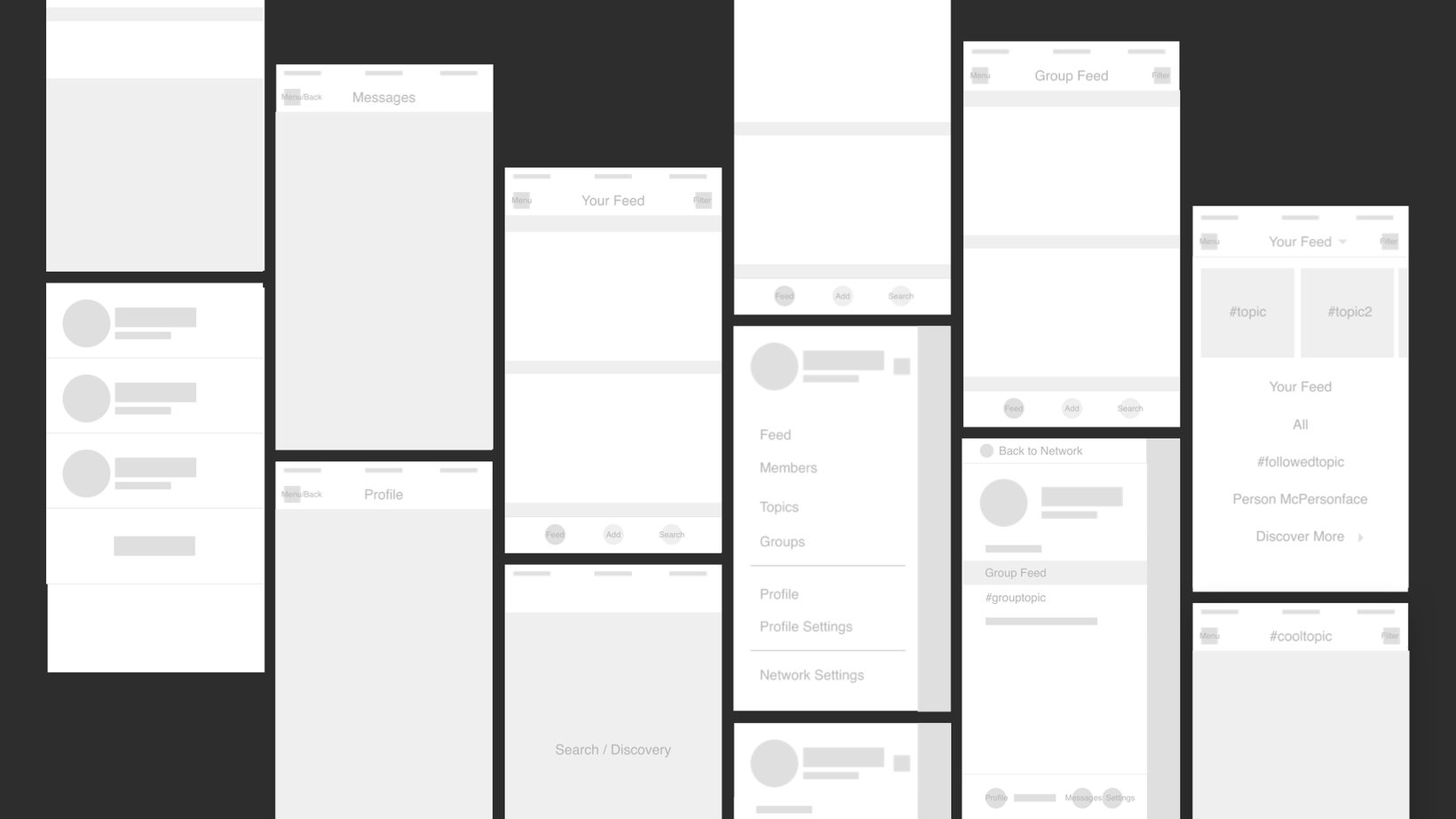
To give my explorations life and to further understand the ramifications of the global navigation changes, I used the internal prototyping tools in Sketch to create a clickable prototype of my explorations. The prototypes leveraged the built-in Sketch prototyping feature to rapidly explore concepts.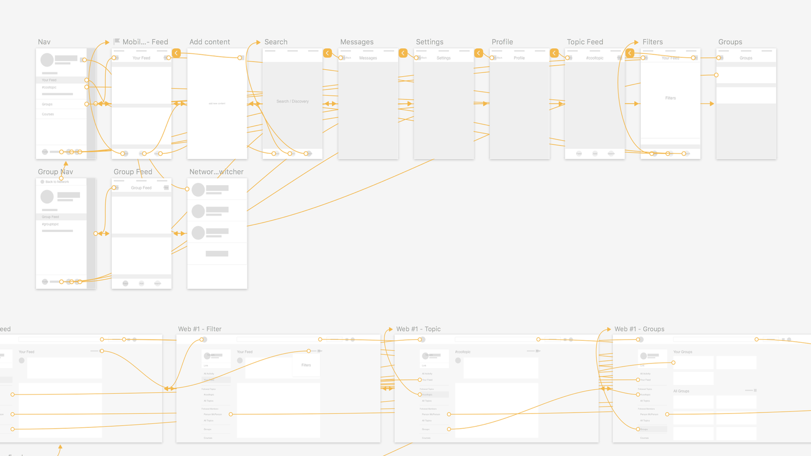
Through these wireframe explorations and prototypes, we chose to add a sidebar to the interface while keeping the main content area mostly untouched. This sidebar would provide context to where a member was when navigating through a network. In addition the sidebar provided more than enough room to expose new and existing features.
Visual Explorations
I worked on visual explorations to help make sure that the changes we've decided on worked well with the existing interface and components. A few of the visual explorations I did, focusing on how color worked within the interface.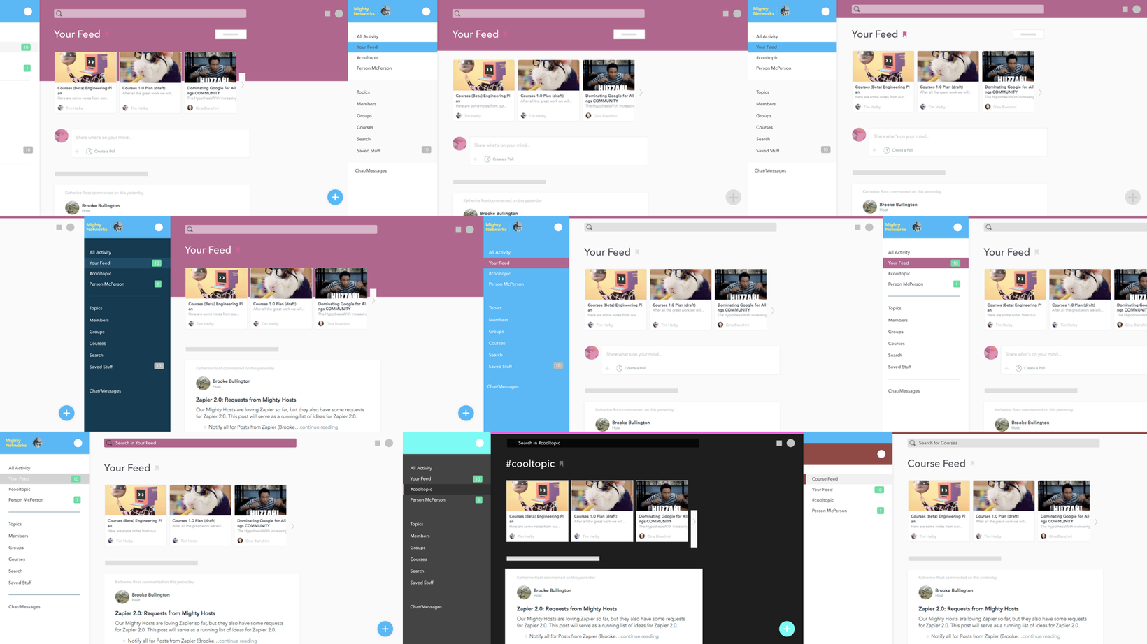
I focused on exploring color. My exploration served two purposes. The first was to see if color could give members a better sense of where they were in a network, helping solve some of the inital problems that triggered this project. Second, to explore how color could be used to help network creators express their unique brands.
After going through multiple rounds of exploration, reviewing each with the team and refining further through their feedback, we decided on a direction that would allow for plenty of flexibility in color choice without interfering with legibility for network members.
With visuals exlored and decided, we created interactive prototypes to test our assumptions with actual customers. I also worked to further define how the web app would act across different devices on different breakpoints.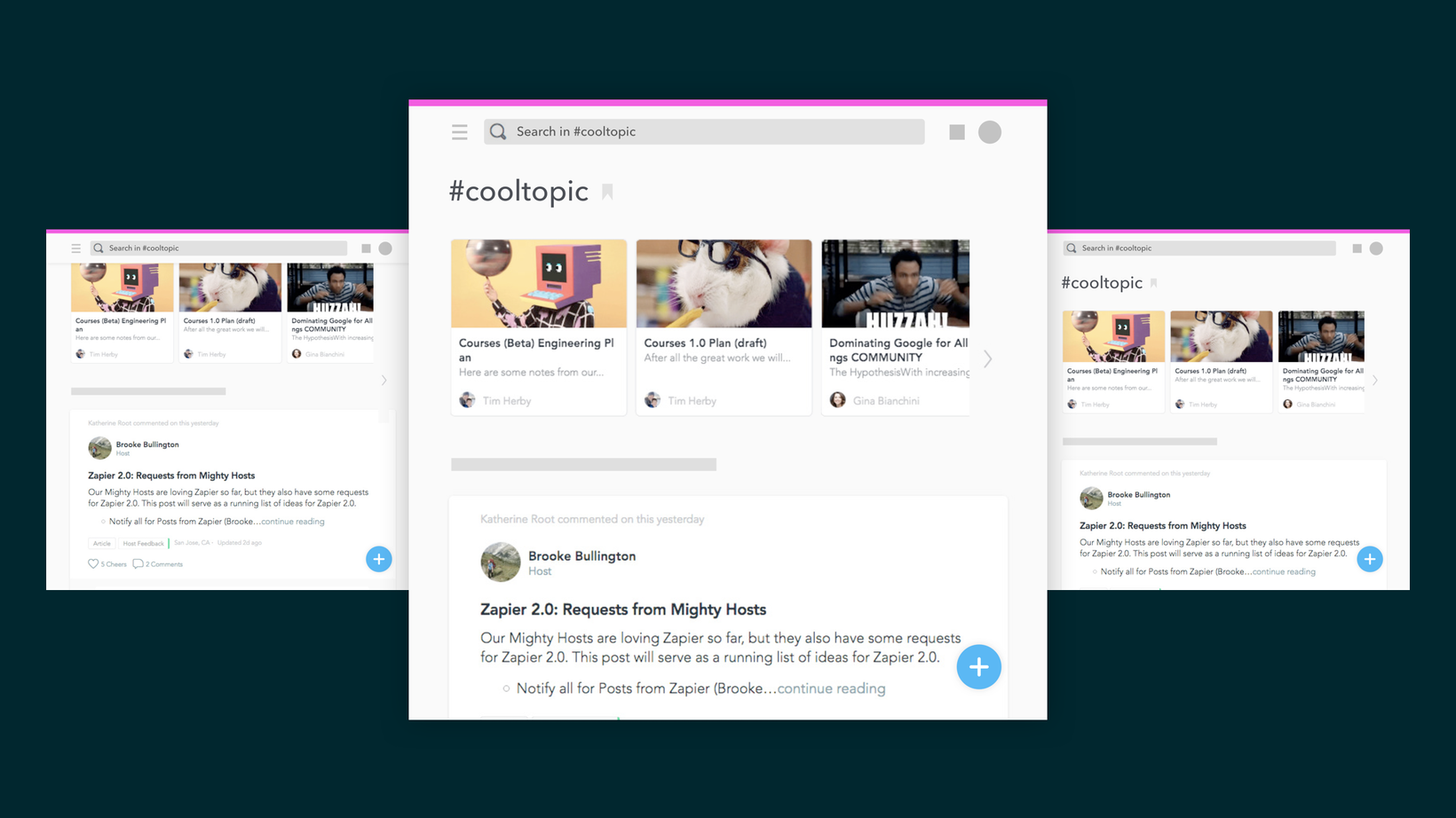
User Testing
I took the lead in helping define and prototype flows to test. I went through a list of our existing problems we had with the navigation and began creating individual prototypes in Sketch to test each of them.I also made sure to include tasks that would address parts of the app people didn't currently have issues with, making sure that our experience didn't degrade.
We ran a number of tests, both in-person and using a remote user testing service. We found that the navigation helped people complete tasks that were otherwise extremely difficult to complete with the previous navigation.
However, there were a few problems. Some of the icons we used in areas of the navigation were confusing to people, making it difficult for them to complete tasks.
We took the time to make the necessary changes to icons and other areas of the app and re-test them as needed. Through the testing we did, we felt confident enough to move onto fulling fleshing out these changes and prepare them for implementation.
Designing Navigation for iOS
After the web was completed, we had to cement these navigation paradigms across mobile platforms. The tab bar on the bottom of both iOS and Android interfaces provided methods of getting to global-level places within the application, such as notifications and the members profile. The side bar on web and mobile was very similar, giving the app across platforms a great sense of consistency.
I put together more prototypes to show how this navigation would work and specs to hand off to engineers.
Finalizing Visuals & Preparing for Implementation
We finalized the visuals through speccing out all of the new components in global navigation, their visuals, and behavior. We made sure to review these with engineers before hand-off. We wanted the specs to be as thourough as possible. A selection of the specs I created to communicate design decisions about the different components and their states.


Launch!
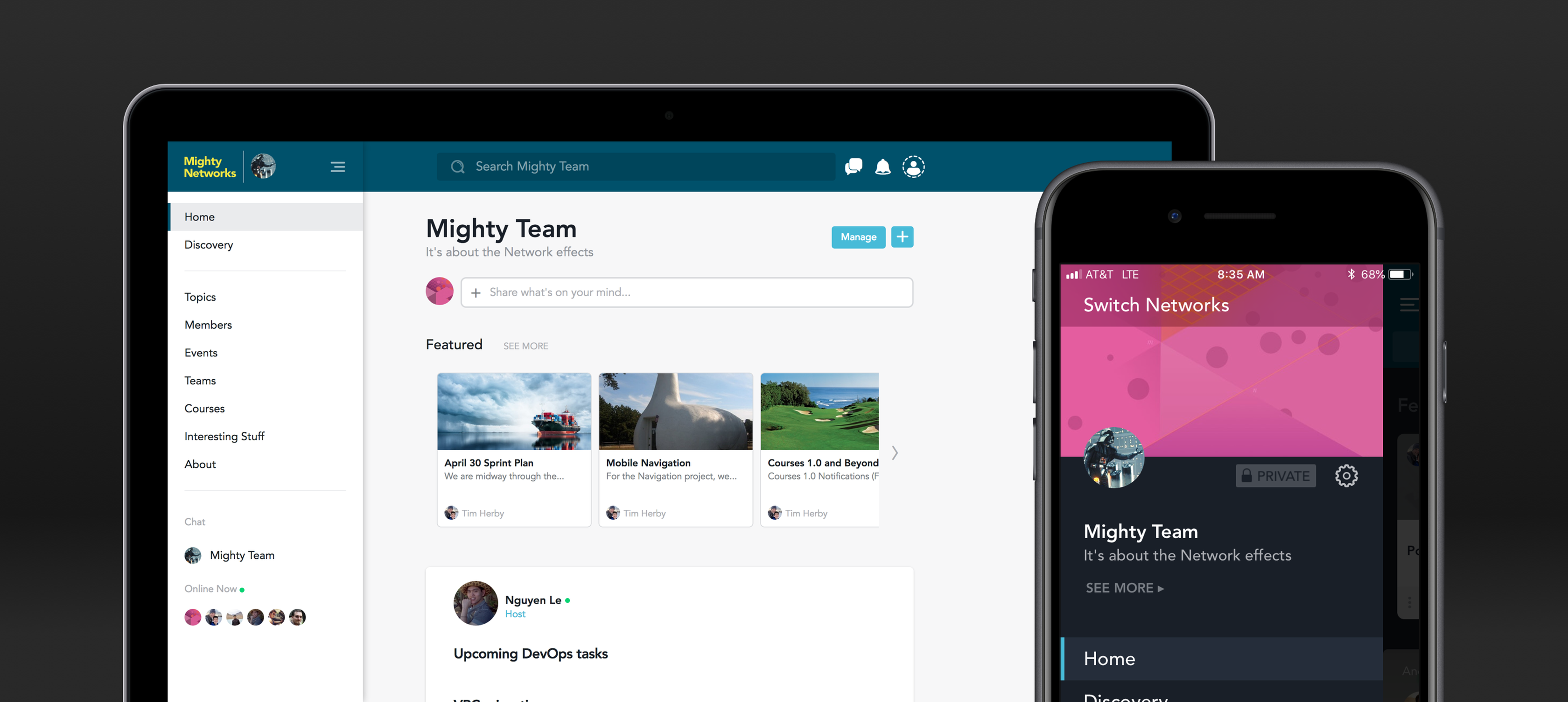
We launched the changes across all platforms at once, after announcing them to those who host different networks a few weeks before. The feedback was overwhelmingly positive. Any problems people did have were minor and either quickly addressed or added to a list of fixes that we started working on shortly after launch. A selection of screens showing the iOS app after launch.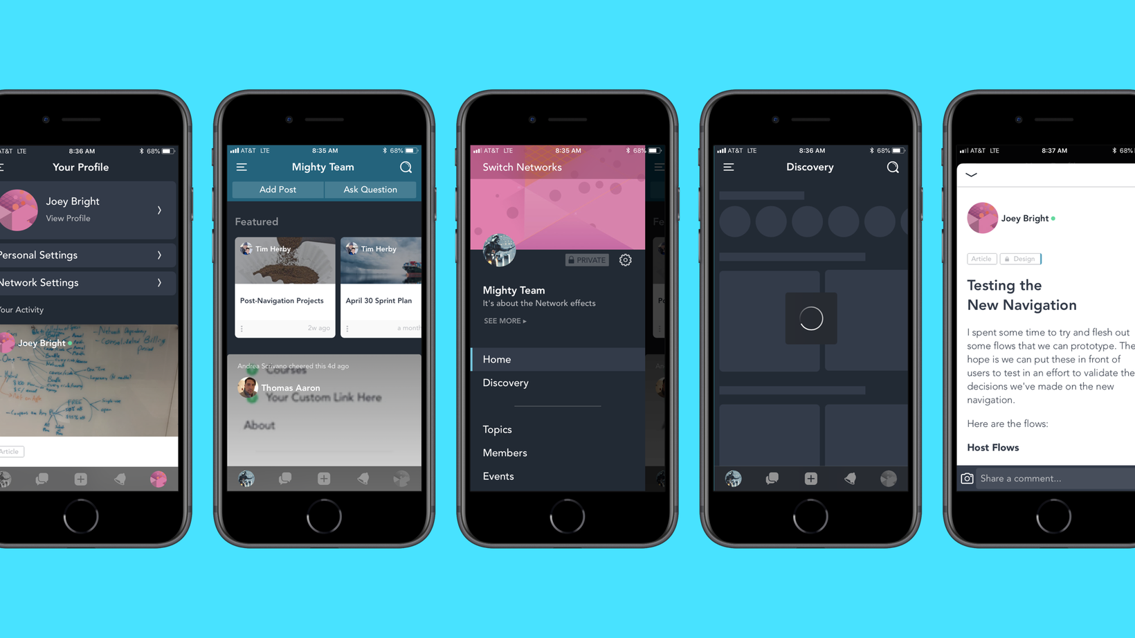
What I Learned
Research for a change to the product as large as this was crucial to its success. With the validate provided through it, we were able to make more confident decisions and get the feature out the door knowing the changes would be positive for our members.
Breaking down the navigation into smaller component specs helped for engineers to understand the thinking behind the underlying systems designed, rather than just seeing different mockups of the changes. This helped create a better end-product and allowed the design and engineering team to speak from a similar understanding of the changes.